Table of Contents
What Makes a Good Garden Design within a Landscape?
Ever heard a song with a cool melody, but the rhythm was so off that you just couldn’t get into it? Well, that’s what happens within your landscape when there’s no contrast within the various hardscape and softscape forms.
Contrast creates visual interest and draws the eyes into the architecture itself. This is done by grouping plants and other things within the landscape based on their shapes and forms. The goals are to create various effects and divide enclosed areas and other spaces to make your yard pleasing to the eyes.
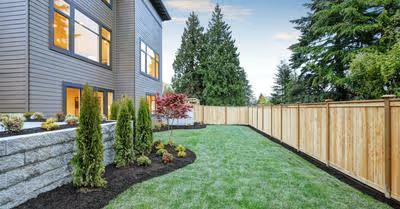
Your landscape should have balance, order and proportion. Add stability by adding narrow verticals in repetition. For example, one measly cactus on its own adds no value to the visual style of the garden. But plant them in clusters near a tall fence and they become a gorgeous looking focal point while making the area look complete.
8 Principles of a Good Garden Design
These basic principles of garden design are meant to be a tool to get you started. However, your garden is your own personal space. Therefore, it’s also important that the landscape brings joy to your life both aesthetically and functionally.
Here are the eight principles of a good garden design:
1. Color
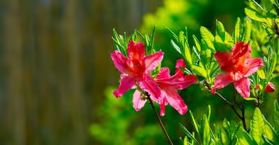
Color in the garden is not only visually seductive, but it also signifies seasonal changes while influencing moods. It acts as a powerful tool that unites various aspects of the landscape and creates visual effects. Cool colors like greens, purples and blues soothe the soul, while warm colors like yellows, oranges and reds improve the look by brightening up the area.
Personally, I have a deep connection to the color purple. But using just one color within the landscape can be a bit simplistic and boring, even for someone who loves the color. Combining it with other color schemes gives the garden a more enchanting, harmonizing look and feel.
But be sure not to overdo it. Adding too many different colors can leave your landscape looking chaotic, versus balanced and orderly. Instead, the color contrast should be more subtle, so they’re much more visually appealing.
2. Contrast
What are the benefits of contrast within a landscape? Well, it puts emphasis on the differences between a hardscape or a plant and the surrounding aspects.
When things are too orderly and balanced, the look can be a bit dull and predictable. But too much contrast can create a look that’s confusing to the eyes and borders on chaotic.
Instead, create contrast within the garden by manipulating colors, textures, sizes, forms and other elements within the landscape. Here are some tips:
Creating Contrast Using Colors
Adding colors that compliment each other is as simple as recognizing the hues that are located on opposite sides of each other on the color wheel. This concept enhances the overall look by making it appear sharper and harmonious. For example, to enhance the look of my purple fetish, I add opposite colors such as green and touches of yellow to make the garden pop more.
Creating Contrast Using Textures
The shapes and sizes of your plants’ leaves are the textures of the garden. Create textural contrast by combining plants with large foliage with plants with smaller leaves. Using this method to create contrast highlights the various characteristics of each individual plant. Larger leaves command attention, while smaller foliage helps soften things up a bit.
Creating Contrast Using Sizes
Size in the garden refers to the width, length and height of a plant at maturity. For example:
- Large Plants – Tall shrubs and trees
- Medium-Sized Plants – Shrubs
- Low-Growing Plants – Grasses and groundcovers
Draw the eyes in by interweaving plants with similar heights into groups. Keep it subtle, though. Try not to make the contrasts in sizes so obvious that the layers of large, medium and low-growing look rigid and out of place.
Creating Contrast Using Forms
In the garden, form refers to a plant’s overall shape. Let’s say your landscape is full of groundcovers and shrubs. Add contrast by infusing plants that grow upright to add height to the garden while grabbing attention. Low-growing plants, such as groundcovers, pull the eyes downward while adding width to the area.
3. Diversity
Diversity is all about compatibility in the garden. Add visual interest by inserting focal points and various accents sparingly, instead of one single focal point, which can be kind of drab. If you prefer a themed garden, add different types of plants with similar colors and shapes.
4. Harmony
Unity and harmony help bring all of the elements of the garden design together in a harmonious fashion. Focus on harmony as well as simplicity to create a unified design with good structure and completeness. This is done by adding containers, pots, flowers, groundcovers, shrubs, trees and other greenery as well as hardscapes for both aesthetic appeal and lots of functionality.
5. Proportion
Proportion is the relationship between the size of one element to another. For example, it wouldn’t make sense to plant a tree that will grow to be 30-feet tall on a small deck. However, a beautiful dwarf Meyer lemon tree makes much more sense. Then, you can add smaller plants with pops of color and contrasting textures around the deck itself.
6. Repetition
Repetition creates rhythm within the landscape when features are positioned correctly. This applies to both softscapes and hardscapes. Some examples of hardscape repetition include:
- Pickets of a fence
- Pavers lining a walkway
- Trees lining a pathway
Give the landscape some pizazz by adding curve patterned walkways next to vertical lines of shrubs. Or make the changes more gradual by planting beds of large plants with warm colors combined with plants with finer textures and cooler colors.
7. Rhythm
Create rhythm within your garden by using repetitive shapes and patterns. This not only adds visual allure but also emphasizes both contrast and texture. Patterns create a focal point that draws the eyes to the area as well as the landscape’s backgrounds.
Use this concept for both softscapes as well as hardscapes. For example, using paver patterns to line borders helps unify the landscape while directing foot traffic throughout the garden.
8. Visual Balance
Just like the earth, every landscape should have an imaginary axis. This is an imaginary line that visually divides the landscape into two separate parts while also connecting multiple points. Placing too many highlighting parts on one side of the landscape draws the eyes to that one area instead of the entire garden itself.
To achieve visual balance in the garden, you must decide where to draw the imaginary axis line based on the central reference point you choose. This could be your back door, a specific tree, a water feature, your favorite garden bed, swimming pool or any other element. Using this principle of good garden design adds visual appeal and balance.
There are two basic types of balance in a garden:
- Symmetrical – Formal
- Asymmetrical – Informal
Symmetrical Balance
Formal balance is the simplest form to use in the garden. Basically, each element on one side of the imaginary line is a mirror image of what’s on the other side. For example, you may plant a tree next to a group of hydrangeas on one side, then mirror that on the other side, while separating both areas with a paved walkway leading to the swimming pool.
Asymmetrical Balance
Informal balance is a bit more complicated but can be just as visually appealing. Let’s say you have a large tree to the right of your yard. You can balance it out by planting three or four smaller trees on the left side to give the landscape a more visually balanced look.
Recent Articles


